Media and Card Components for React
Cards, galleries, players, and hover effects. Photo stacks and lightboxes for imagery, a curved video player and music cards for playback, clocks and contribution charts for data, plus flip, reveal, and expand interactions for feature grids.
20 components · Browse all components

Link Preview
Hyperlinks that show an image tooltip on hover, tracking your cursor with a parallax tilt on the artwork.
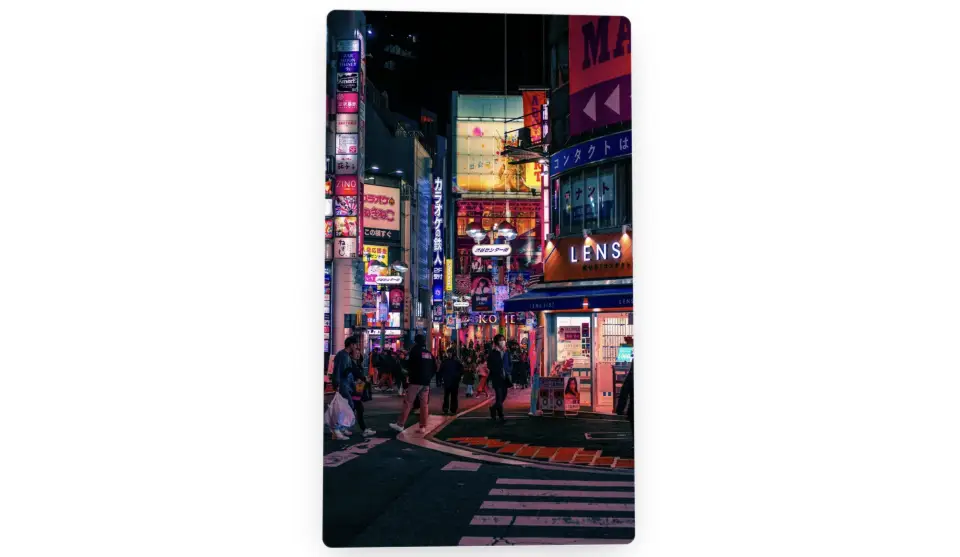
Direction-Aware Flip Card
A flip card that swings toward the side your cursor enters from, with a tracked sheen, parallax tilt, and a lifting shadow.
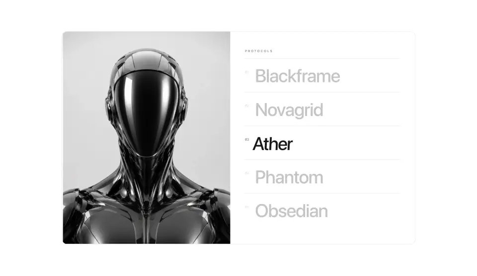
Hover Reveal
A two-column client index. Hover a name and its preview scales into focus while the row drifts under your cursor.
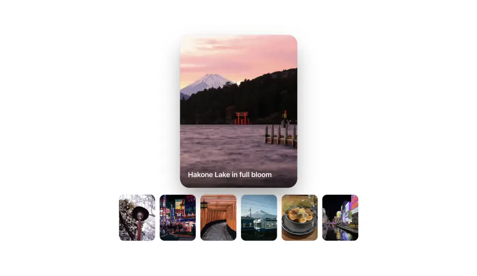
Hero Card Stack
A fanned arc of overlapping artwork cards. Hover one and it springs forward while its neighbors nudge aside.
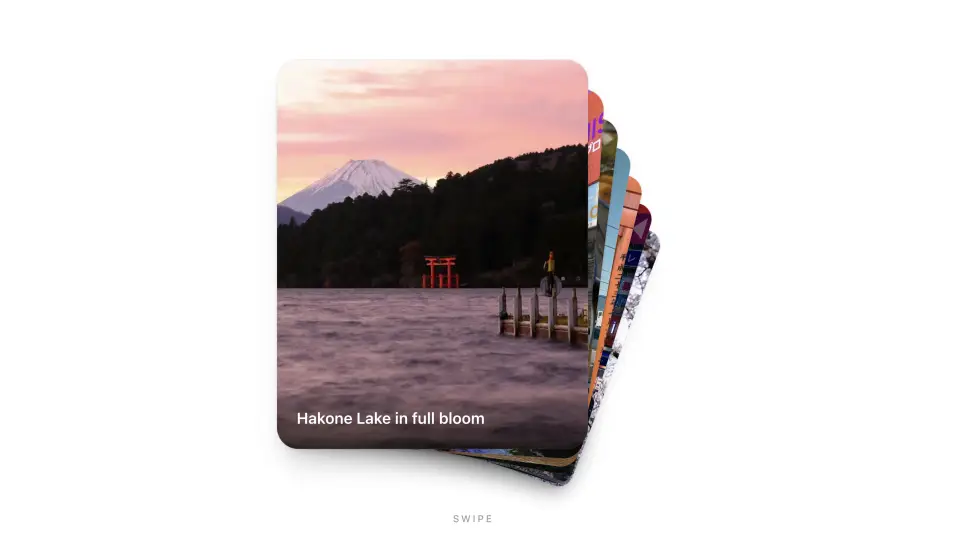
Swipe Card Deck
A swipeable card deck. The front card drags off in your swipe direction, then tucks behind a fanned stack. Built for touch, with a reduced-motion fallback.
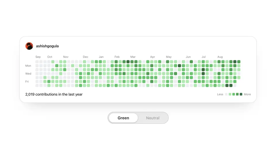
GitHub Chart
A GitHub contribution graph with a linked profile header, hover tooltips, and a staggered reveal. Point it at any username for live data, or feed it your own counts.
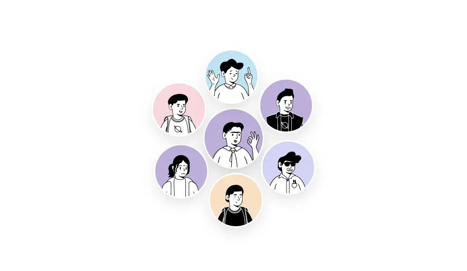
Avatar Cluster
Avatars fly in from the blurred foreground and pack into a slowly orbiting rosette, computed for any head-count.
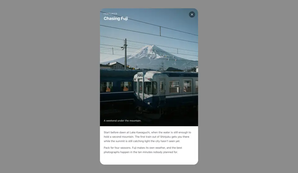
Expanding Card
A feature card that grows from its place in the grid into a full detail view, artwork welded to the card the whole way, with body copy that lands after it settles.
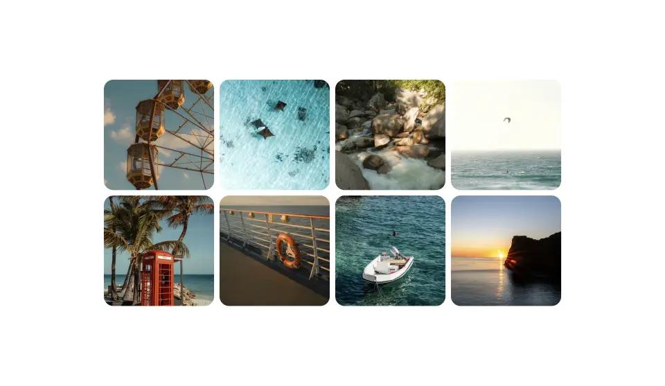
Photo Lightbox
An image grid that flies the tapped photo into a fullscreen viewer. Swipe between shots, then drag down and let go — it shrinks in your hand and flicks back to its cell.
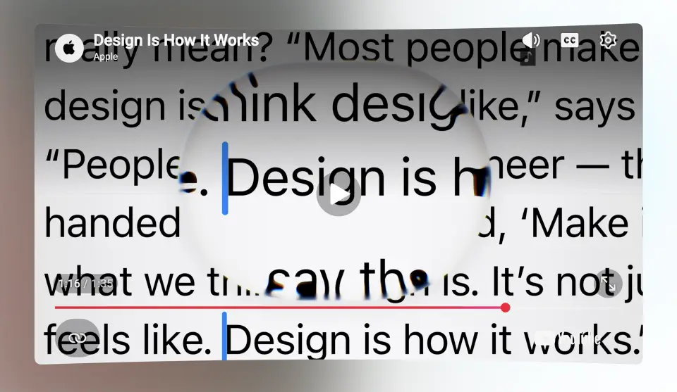
Curved Video Player
A YouTube player on an IMAX-style curved screen, backlit by ambient light that tracks playback, with YouTube's own controls left in charge. Letterboxed films are measured and cropped to fit.
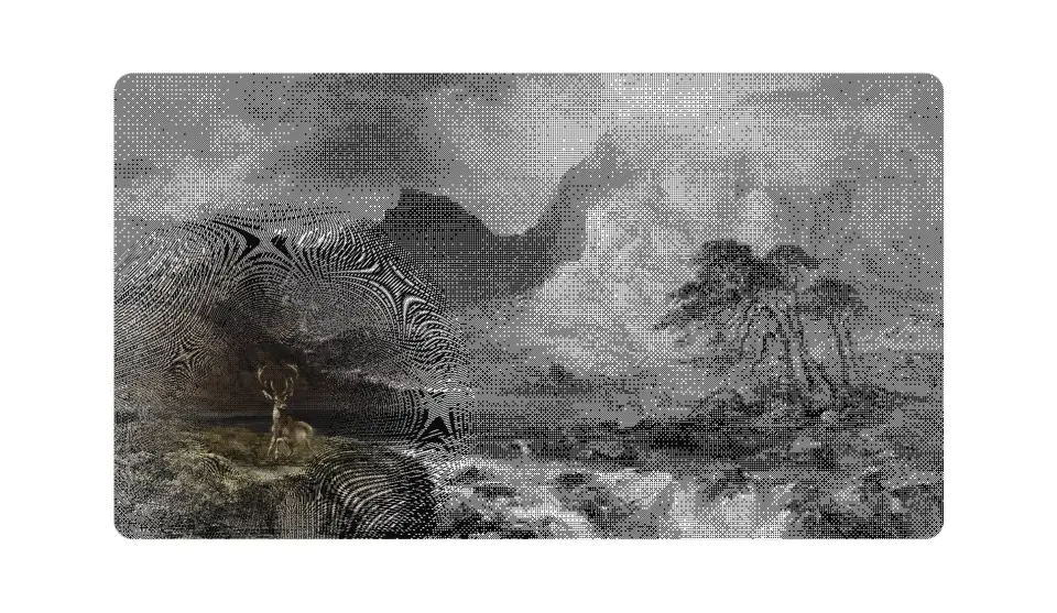
Dither Renderer
Any image, redrawn live as ordered Bayer dither on the GPU. The cursor acts like a loupe — the pattern sharpens and the original colors develop under it.
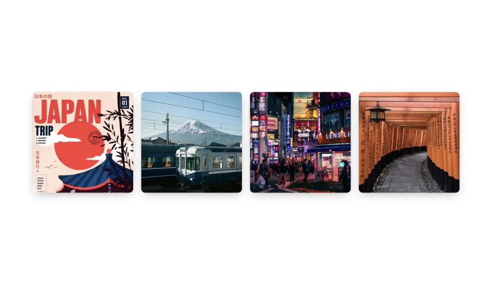
Photo Stack
A neat deck of photos with the rest peeking out behind the cover. Hover and they slide into a row one by one on a spring.
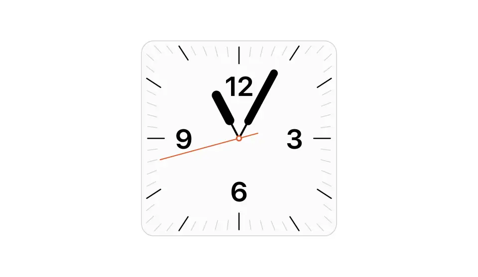
Watch Face
An Apple-style analog clock whose tick ring and numerals wrap the card's own rounded corners, with a vermillion sweeping second hand.
Digital Watch Face
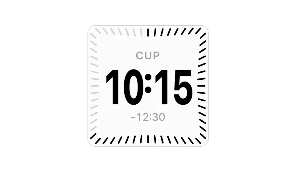
The iOS world-clock widget as a live component — a tick ring fills with the passing seconds around rolling digits, a city label, and the offset from your local time.
Apple Music Card
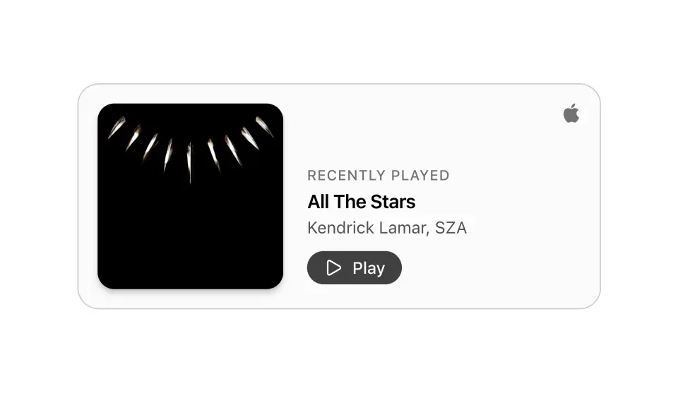
A now-playing card that resolves tracks straight from iTunes search URLs and plays their previews, shuffling through the list and auto-advancing between songs.
Album Cover
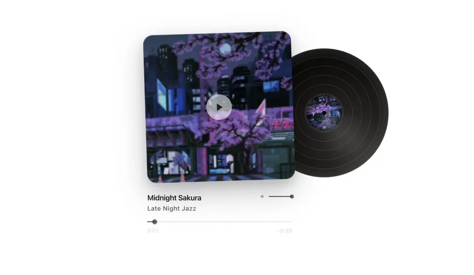
A vinyl sleeve player. The record lifts out, spins, and responds to the transport controls.
Retro Music Player
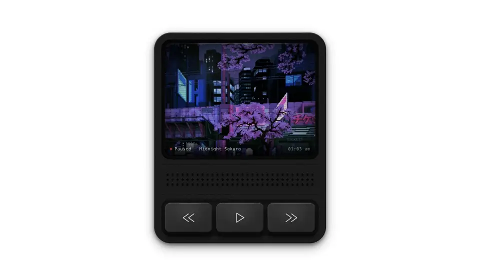
A handheld retro media player with a CRT display, a speaker grill, and spring-loaded transport buttons.
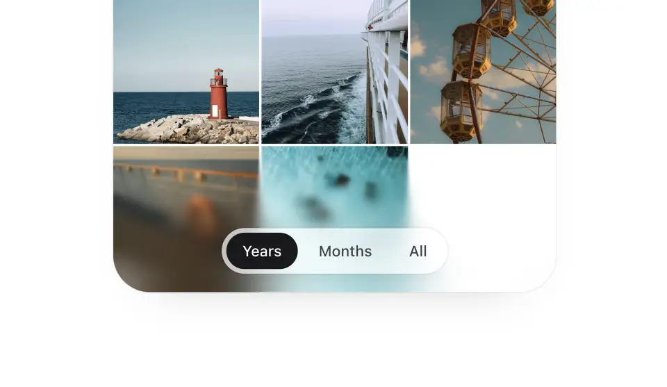
Progressive Blur
Apple-style scroll-edge blur: content dissolves into stacked backdrop layers that get progressively stronger toward the edge, with an optional tint and room for a floating header or toolbar inside.
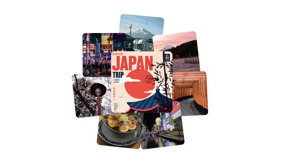
Radial Pop-out
A center card ringed by smaller cards. Hovering the center scatters them outward with spring overshoot; leaving snaps them back behind.

Hero Media Scroll-Out
A hero screenshot that stands up from a tilted perspective to flat as the visitor scrolls in — transform-only, driven by scroll position.